
E-Commerce Conversion Enhancement
UI/UX Case Study
A Design That Boosts Sales

Project Brief
Understanding user shopping behaviors, analyzing the reasons for cart abandonment, and formulating solutions.
Project Type
Individual Case Study
Tools
Timeline
Dec 2023 - Jan 2024 / 8 Weeks
Figma

Skills
Research, User Interview, Persona, Experience Map, Wireframing, Prototyping
P R O B L E M S P A C E .
E-commerce faces a 70% cart abandonment rate and encounters challenges in converting visitors to buyers, leading to a global average conversion rate below 3%.
Cart Abandonment Rate on Different Devices
Desktop 70%
Mobile
86%
Tablets
81%
The average cart abandonment rate differs by device, with mobile and tablet devices having the highest percentage of shoppers hitting the exit button on a checkout page.
2023, Baymard Institute
A whopping 2 out of 3 users choose to abandon their purchase.
Reasons for Cart Abandonments
United States; 2023; 2,219 Respondents
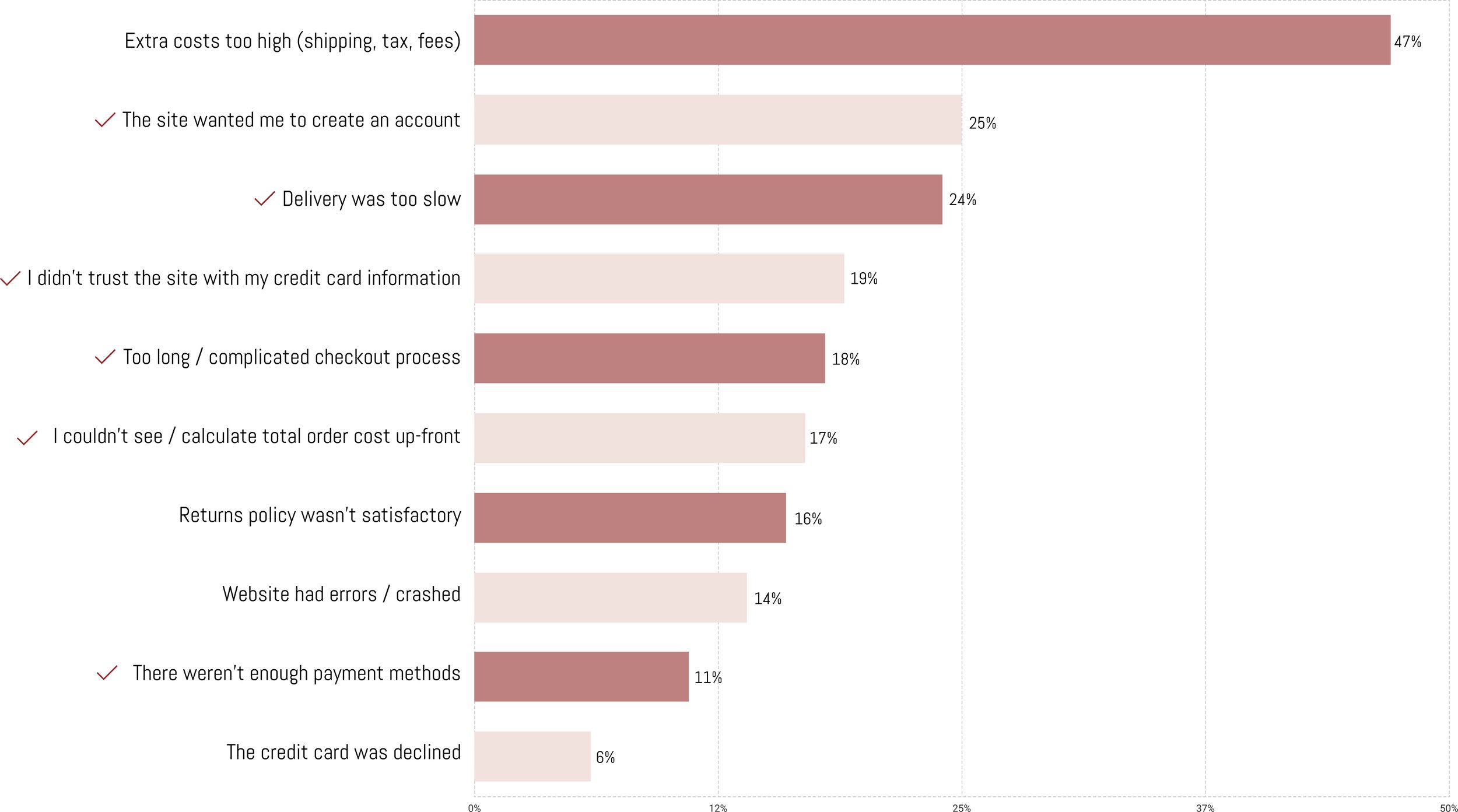
Baymard Institute
*Check marks are what I defined as design opportunities.

SaleCycle
“The longer customers take to decide, the higher the cart abandonment rate.”
baymard.com
“Design improvements can potentially boost the average e-commerce site's conversion rate by 35%.”
How might we assist website visitors in seamlessly navigating
from search to checkout in order to minimize cart abandonment
and increase the conversion rate?
S O L U T I O N .
Design Goals

Simple Design
Featuring a simple and clean design for easy navigation. The first impression is key to gaining trust and initiating shopping, ultimately converting visitors into buyers.

Express Checkout
Understanding the requirements of shopping behavior and providing a fast checkout. Noticeably indicating a CTA with a focus on security and speed is key.

Clear Information
Customers can't physically touch the product and heavily rely on photos, product descriptions, and reviews. Providing clear information including size guide, prices, customer support channel is the key.
User Flow
1.Landing
2. Browsing
3. Adding to a cart
4. Checkout
D E S I G N T H I N K I N G .

[Landing Page]

Interview Quote
“No matter what I add to a shopping cart, if I see a shipping cost of $30, I immediately abandon the website.”
Design Solution
The banner stays on top of the page, stating 'Free shipping over $75 for members.' This way, customers are aware of how much to spend to be eligible and are encouraged to sign up.

[Landing Page]
Research Finding
17% of people abandon the site because they couldn't see or calculate the total order cost up-front.
Design Solution
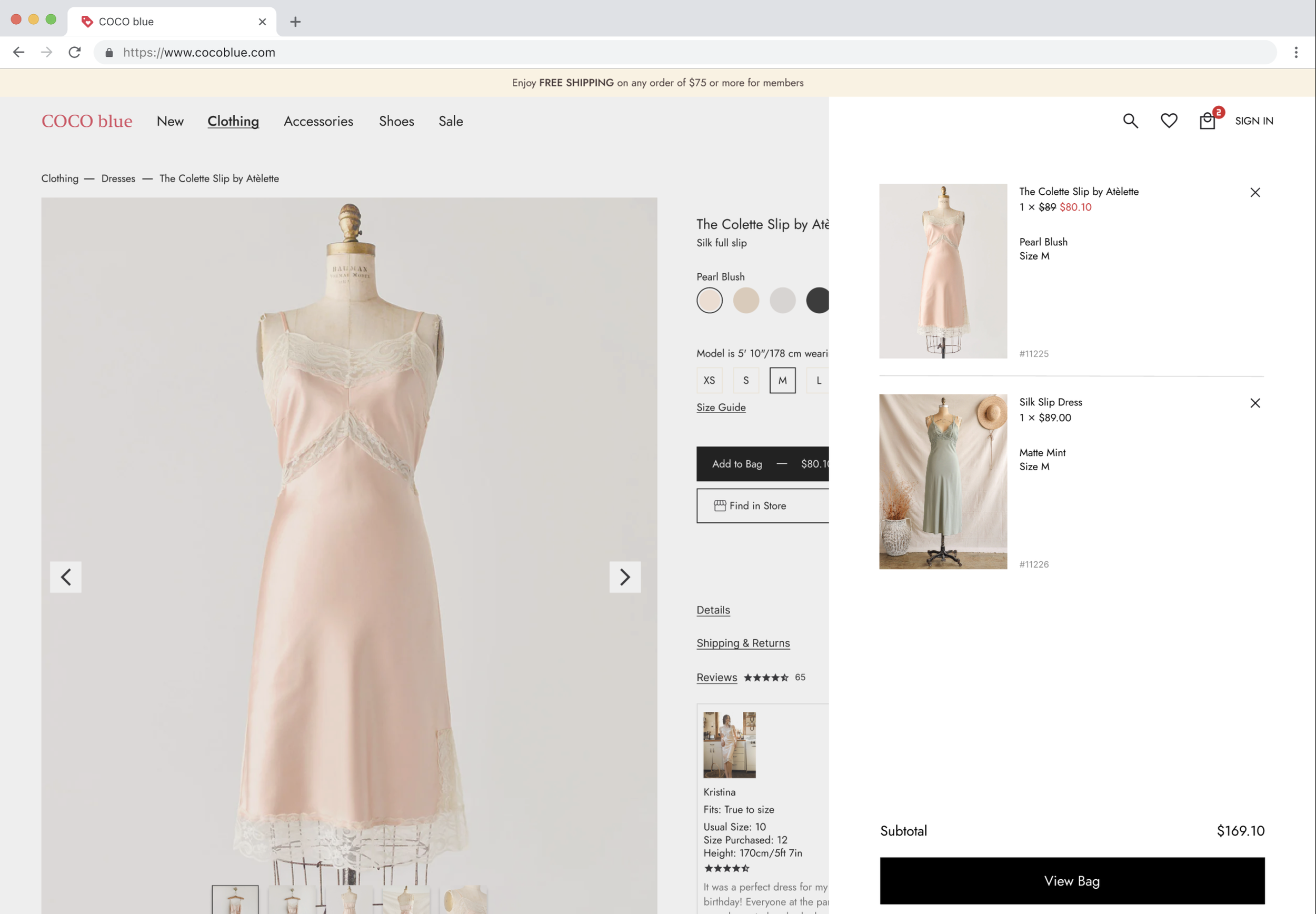
Providing the tax-included price requires the customer's delivery location. On the product page, each item displays its attached retail price, with sale prices highlighted in red.
Interview Insight
Users typically save desired items in a shopping cart for future reference without intending to make a purchase.
Design Solution
Each item features a heart icon for users to click and save for future reference, with the wish list conveniently located in the top right corner.

[Product Page]
Usability Heuristics Focus
#6: Recognition rather than recall
Design Solution
Providing indicators, including page navigation and displaying selected options like size and color, with the cart icon notifying the user of the quantity added.
[Log-In Page]

Research Finding
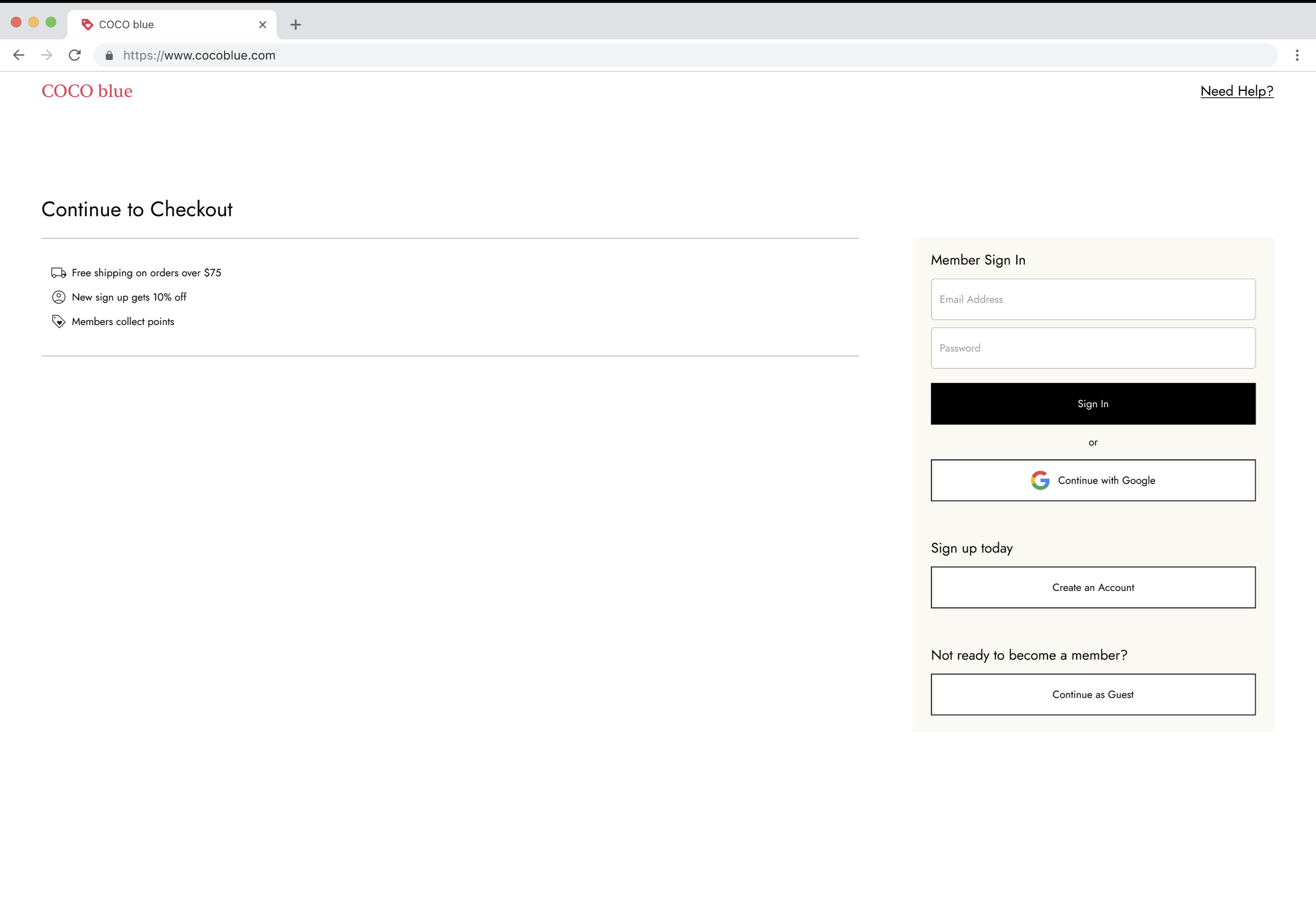
25% of people abandon the site because the site asked them to create an account.
Design Solution
Giving users the option to choose from external providers, especially widely used ones such as Google for email accounts.

[Shipping Input Page]
Research Finding
18% of people abandon the site because checkout process was too long or complicated.
Interview Quote
“I want max 2 pages of automatic checkout, no registration.”
Design Solution
Providing users with a concise 2-step progress bar: the first step for shipping and payment information input, and the second step for review and submission.

[Payment Input Page]
Research Finding
19% of people abandon the site because they didn't trust the site with their credit card information.
11% due to there weren't enough payment methods.
Interview Quote
“Putting my credit card information on the unknown website is scary. I wouldn’t know if it’s a scam.”
Design Solution
Offering users a wide range of payment methods, accompanied by a reassuring message such as 'all transactions are secure and encrypted' to build user trust.
T U R N I N G P O I N T .
As a former store manager at Urban Outfitters, I always monitored the live conversion rate for my store. In brick-and-mortar stores, I could directly interact with customers and implement short or long-term solutions to address their needs in the moment, and it affected my conversion rate immediately.
My initial approach for this project was to leverage my 10 years of experience working directly with customers. However, I soon realized that online platforms present slightly different challenges.
While conducting research through various resources (Shopify, Baymard Institute, Statista, Forbes, etc.) and in-person user interviews, I learned to adopt different strategies for the digital platform to improve conversion rates.
Brick-and-mortar Stores
Customer can speak to staff right away.

Customers can touch and feel the products and try on before purchasing.
Getting style inspiration from mannequins, displays, store staffs.
No need to provide personal information at checkout.
Easy tap for payment.
Customers take purchased items right away with no need for shipping fees.
Online Shop Solution
Effortless navigation to access customer support channels or the FAQ section.
Providing detailed information, including price, photos, product descriptions, size guide, reviews, and hassle-free returns.
AI-generated personalized recommendations, upselling, and cross-selling.
Allowing guest checkout or enabling sign-in with an associated account, such as Google, and saving address information.
Offering multiple payment options, including a digital wallet for one-click payments.
Providing the ETA for fast delivery and offering free shipping for orders over a certain amount.
P R O C E S S .
Sketches

1. Landing Page
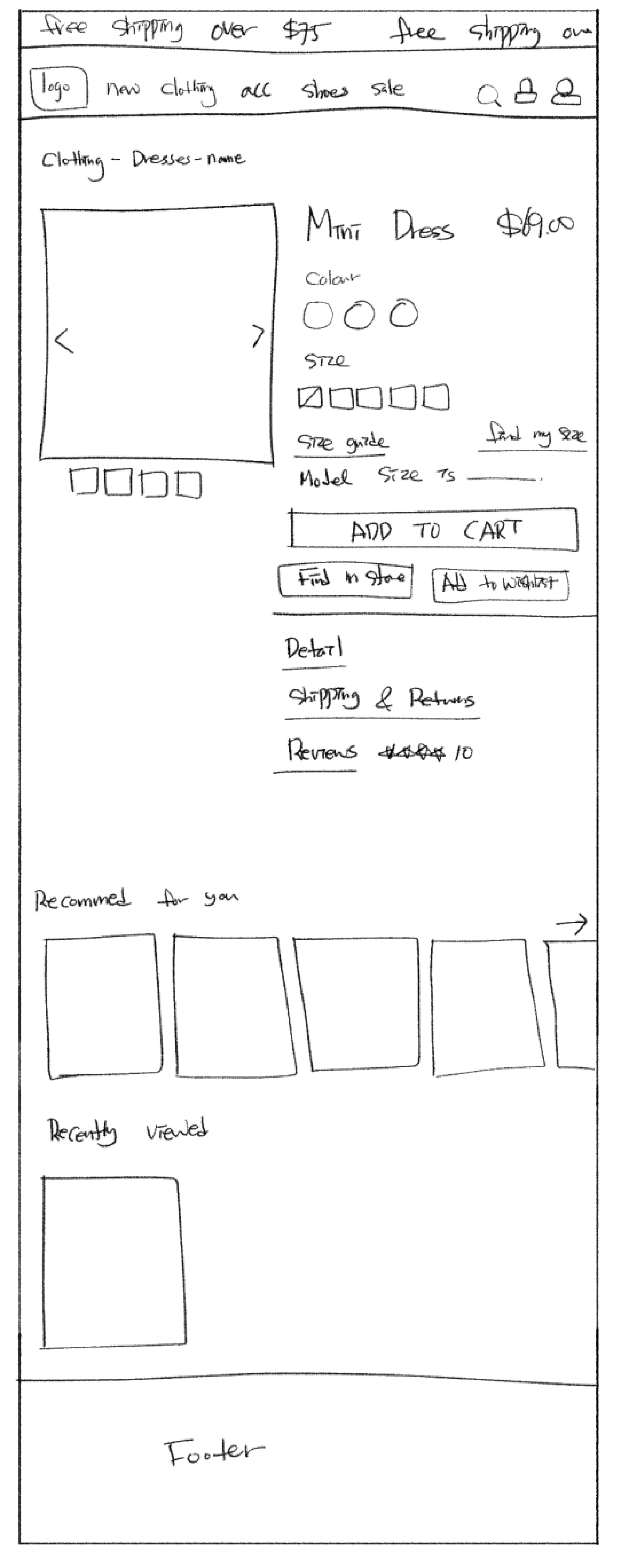
2. Product Detail Page

3. My Cart Page

4. Log-In Page

5. Shipping Information Page

6. Payment Information Page

7. Review Page

8. Confirmation Page

1. Landing Page
Wireframing

2. Product Detail Page

3. My Cart Page

4. Log-In Page

5. Shipping Information Page

6. Payment Information Page

7. Review Page

8. Confirmation Page
Organizing My Work

1. Working alone can be messy and I always try to keep myself organized starting from Pages Separation.


2. Then every screen is into frames.


3. Lastly, group each section into smaller frames.
T R Y I T Y O U R S E L F !
R E F L E C T I O N .
“E-commerce faces a 70% cart abandonment rate and encounters challenges in converting visitors to buyers, leading to a global average conversion rate below 3%.”
To address these challenges, my strategy involves leveraging technology based on a foundation of understanding shopping behaviour and employing human-centered design. I explore tactics like one-click payment to reduce decision time, recognizing the significance of website information for customers, and emphasizing transparent information for customer loyalty.
While initially overwhelmed by the broad scope, I planned step-by-step solutions, focusing on every design element within the shopping experience journey— from meticulous button design and clean page layouts to building the best possible path until completing the checkout process— all to provide maximum convenience for the user.
As my next step, I will further implement advanced strategies, such as an affiliate program, better-fit recommendations, and automated returns.